User experience and interface design
Critique
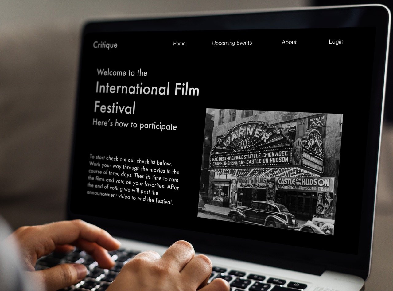
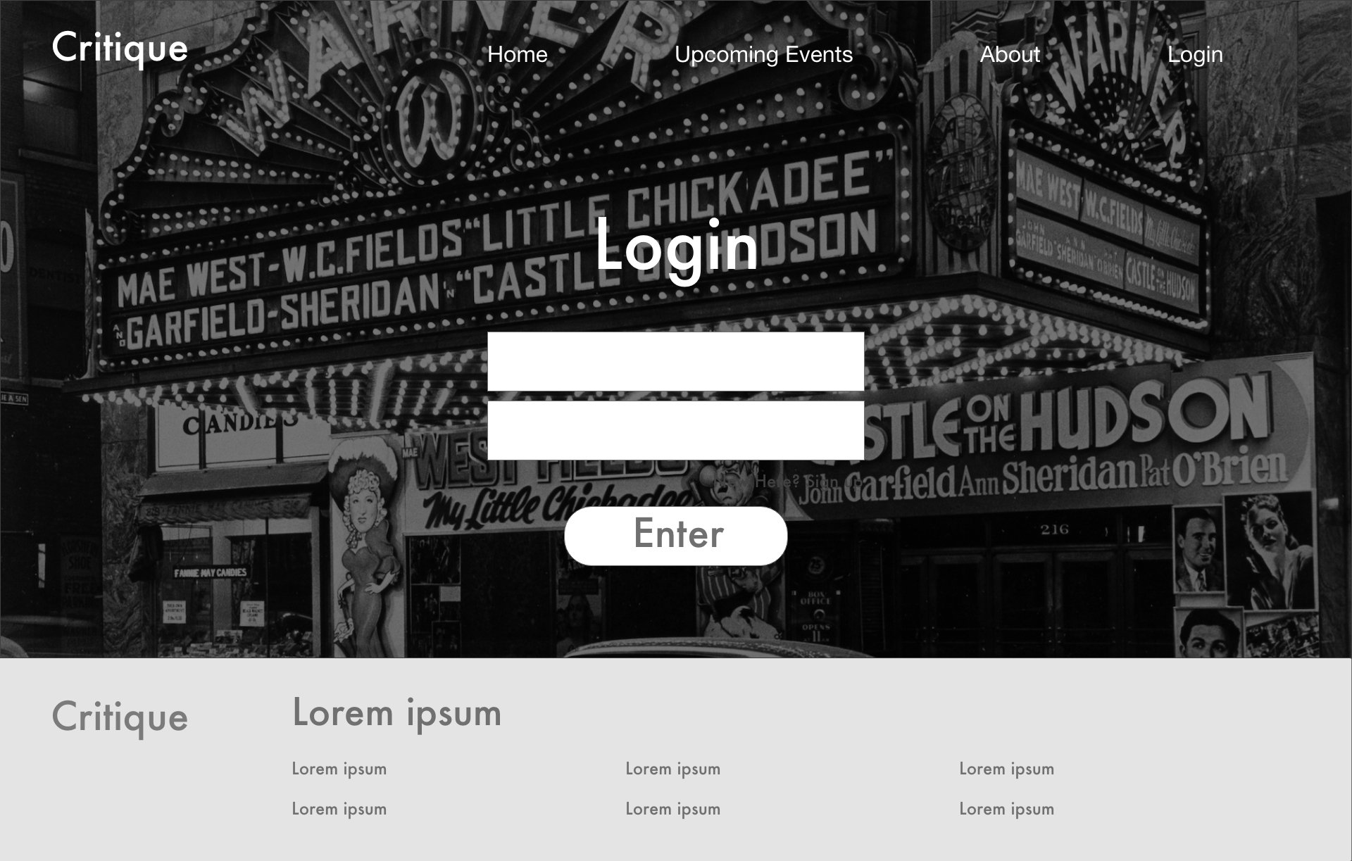
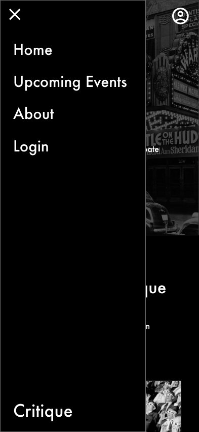
A film festival voting flow website design
Film Festival Voting Flow building Strategy
-
In this project, my role was to work independently on creating a remote voting flow for film festivals. I got to experiment the bast ways people could participate in these events remotely and still feel involved. The goal of the project had started with the understanding that people needed access to vote but became an interesting interface for people to participate in the festival process from the comfort of their homes.
The target audience for this app is students and individuals who enjoy films and want to attend film festivals no matter where they are. The demographic age is from fifteen to about thirty two.
-
I created personas to get a sense of why people might want to use a film festival voting flow remotely from an actual festival. After creating personas for more context and a person centered product I made several user journey maps. These user journey maps help to then get an idea of how my personas might go about using a product like I am trying to make in order to get a clear idea of what the website will need to have access to.
-
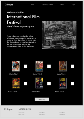
After creating the outline for what I need to include and center around aspects that will make the website useful I started to create wireframes. After creating the wireframes I moved onto planning the usability test and creating a low fidelity prototyped. During testing our key performance indicators used were;
Use of Navigation vs. Search, To navigate through the app to complete tasks.
System usability scale, How useful would it be for students to use the system
Time on Task, App should be quick and efficient to use
-
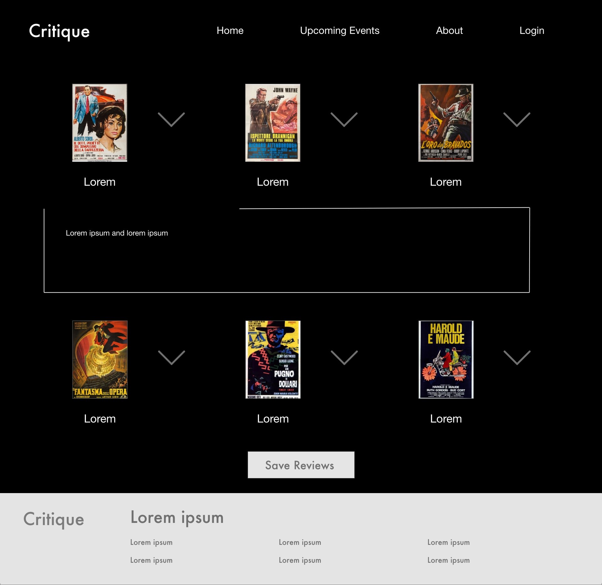
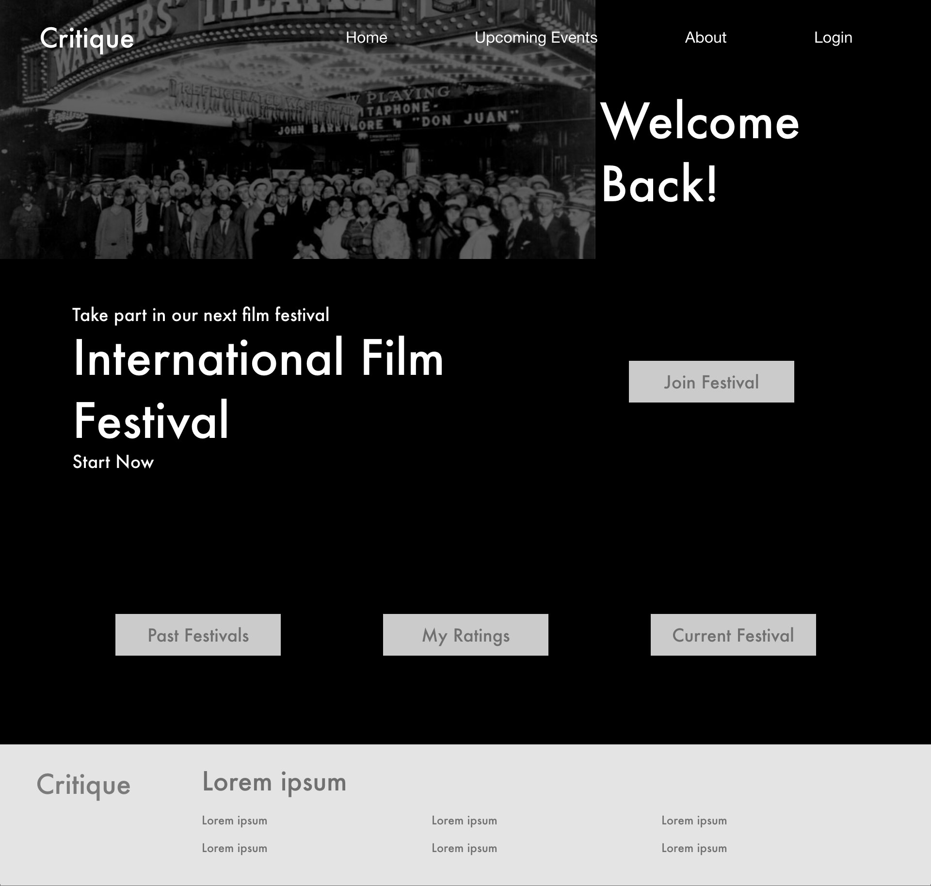
After the usability study of the low fidelity prototype I found that the project needed more pages in order to offer all that users would want to come back and use the website again. Things that needed to be added was a festivals archives, movie reviews and place for them to go back to find them. Then finally, the page for voting was changed and solidified to be set for what most film festivals use.
-
The strategy through this project was to first make sure that aspects of the website would all be useful and create a sense of value to the user. As the project progressed the process became using the study's findings to fuel our additions and what we decided to simplify on. Creating a website that was both useful and fun to interact with.
-
first round of usability tests showed that more information and pages needed to be added. In the second round of usability testing the main focus became about fixing smaller yet just as important aspects that were missing or misplaced throughout the site. Finally it came down to revisions and small changes to the site like buttons and pop–ups.
Once final revisions were completed it was time for one more overview and to revisit both strategy and the problems that had popped up in order to make sure all the original requirements were met.









Mobile only project
Academic Planner
Process
-
My role in this project was to be the sole UX Designer and Researcher of this independent project where the goal is to create an app that leads the user to just focus on academics and balance in their lives.
The goal of this project was to create a useful and clean calendar interface that students will want to interact with. It is an academic health calendar app that makes it more automated to plan for academic deadlines.
The target audience for this app is students and individuals who work with projects and tasks in mind. The demographic age is from fifteen to about thirty two.
-
After creating personas for more context and a person centered product I made several user journey maps. These add more focus to what I needed to then create to make the product more useful and have easy to access actions.
During the first round of testing our key performance indicators used were
Use of Navigation vs. Search, To navigate through the app to complete tasks.
System usability scale, How useful would it be for students to use the system
Time on Task, App should be quick and efficient to use
-
The initial strategy with the sketches was to see how much information could be fit on the home screen without creating clutter or making it harder to see. once the initial sketches were done they were remade in Figma while editing them to make them more simplified and spacious. This led to a rough draft that had good spacing and thoughtful placement of information.
-
Testing round 1 findings
Need to have pages to add information
Side scroll aspects are not very effective
App is accessible and fairly intuitive
Testing round 2 findings
Flow is better without side scrolling aspects
Additional pages give more context to what the user is trying to achieve
Refine how much information is present based off what the user really needs
-
Final revisions included fixing colors and creating a final look for the calendars.
Final run through and Final thoughts:
When I finished these designs and creating pathways for them to each interact. While then doing final cuts and edits to make sure that everything is useful and can function with clickers as well as can be read using a screen reader.


![Google UX Design Certificate - User Journey Map [Template]-4.jpg](https://images.squarespace-cdn.com/content/v1/60513f0328a4027952f89f9c/495a07c4-6c80-40b8-9237-b0db4f7bc335/Google+UX+Design+Certificate+-+User+Journey+Map+%5BTemplate%5D-4.jpg)


